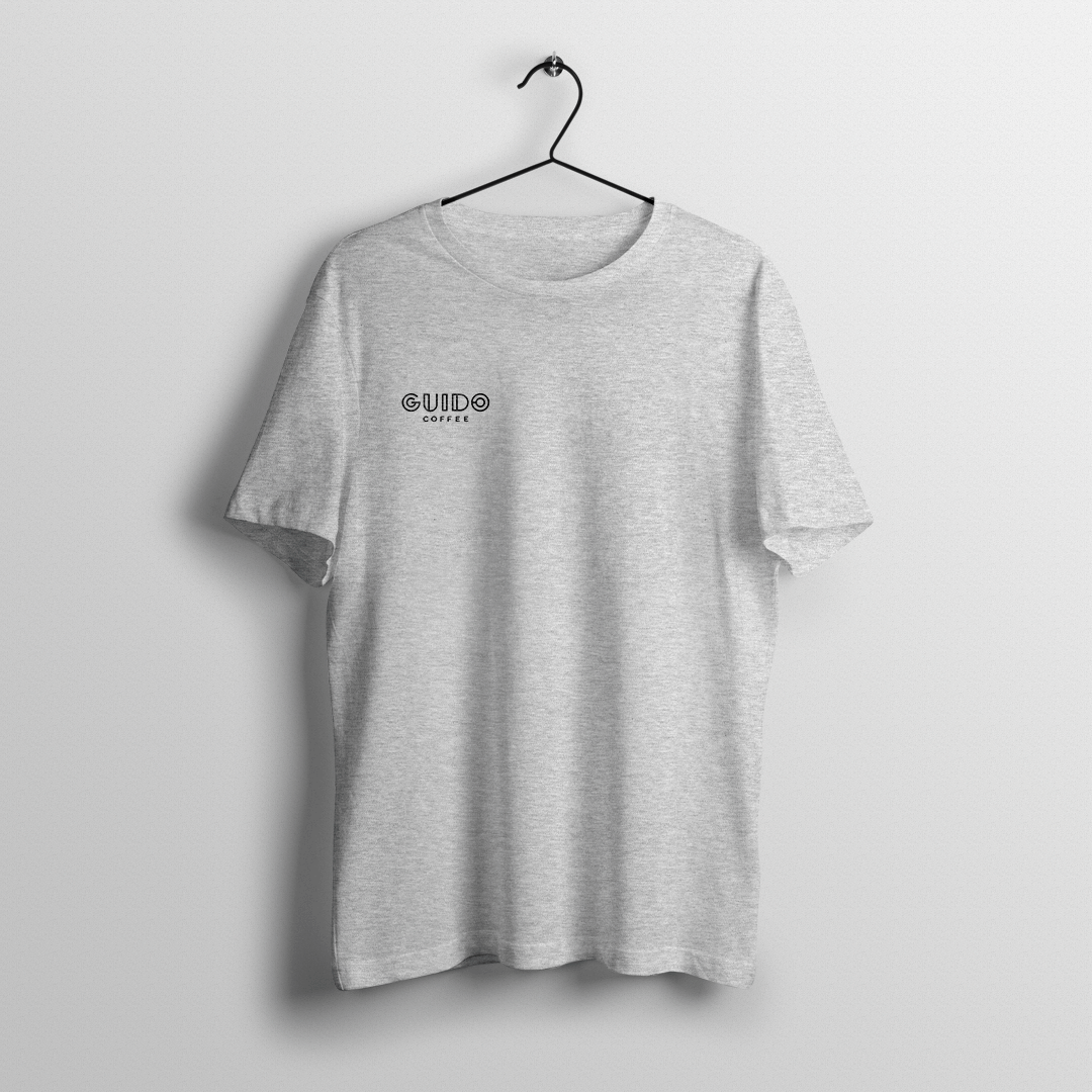
Guido is the coffee maven—a bold guide sharing expertise on perfectly roasted coffee through striking, high-energy packaging. For this project, we crafted a dynamic visual identity and packaging design that captures Guido’s edgy and explosive spirit.
Industry
➝ Food and Beverage
Region
➝ Romania
Delivery
➝ Visual Identity
➝ Packaging
Team
➝ Paul Vîrlan
➝ Bianca Vasile


Packaging Architecture
The packaging architecture was designed around three main categories, allowing the brand to play with product variety by applying a cardboard sleeve that aligns with the color palette and graphics specific to each category.


Core: Featuring dominant notes of chocolate, caramel, and nuts, this coffee can be brewed using most methods with ease.

Explorer: Designed for those eager to explore floral and fruity notes and those who take a more precise approach to brewing techniques.

Vision: The ultimate reward for seekers of the extraordinary who are willing to follow our brewing recommendations to unlock the fullest flavor potential.


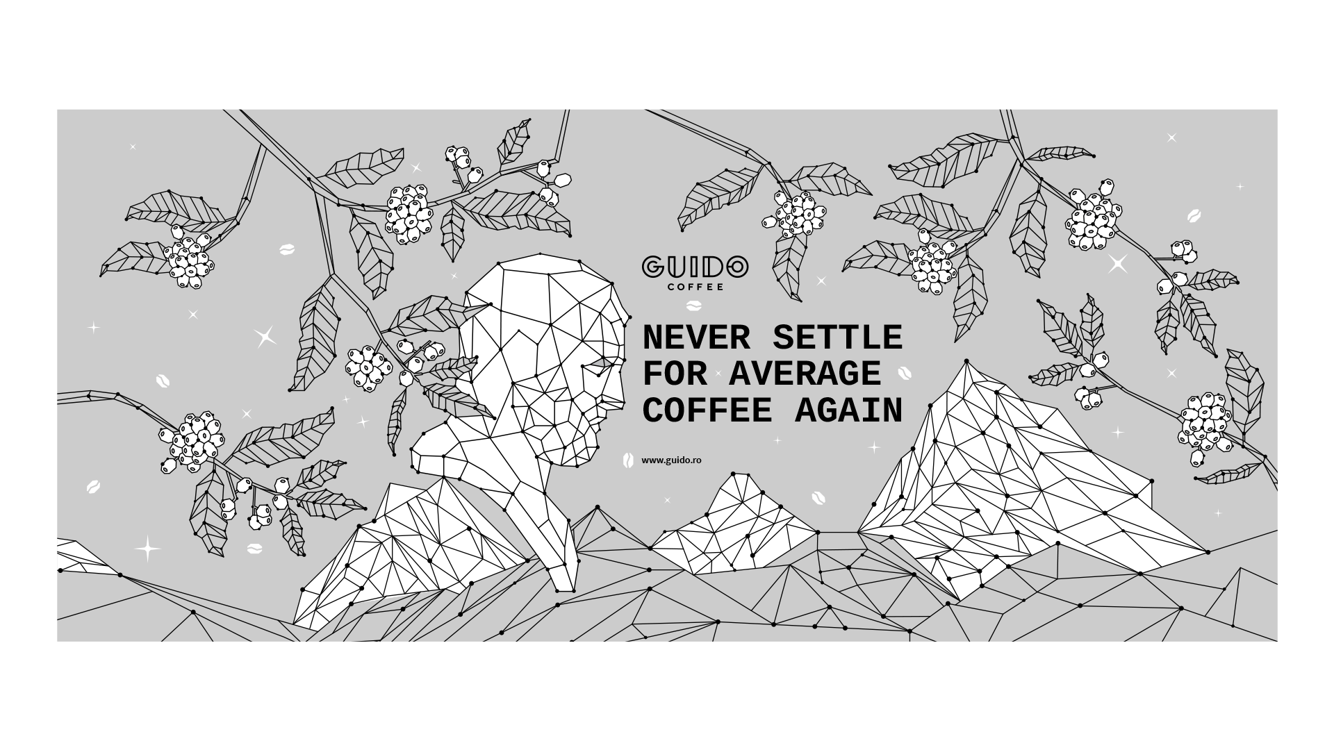
A visual identity for a guide that transforms customer needs and desires into the perfect coffee experience through the language of color.