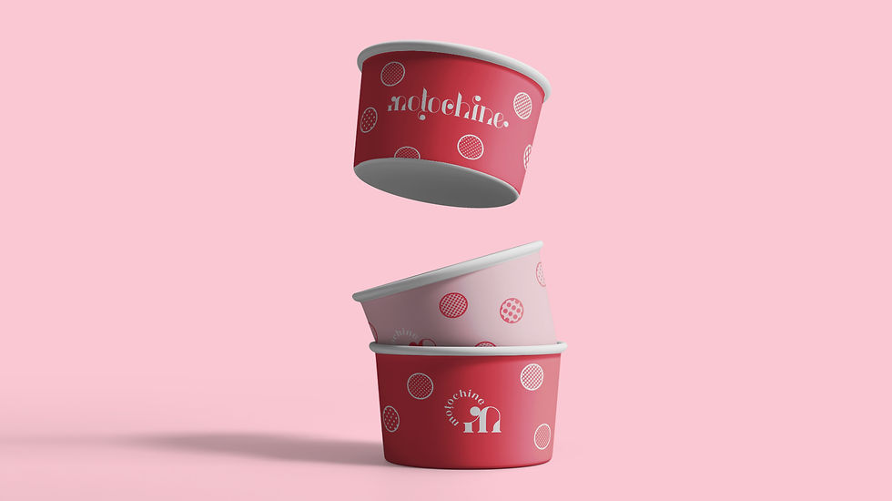
Moțochine is a street food sweet shop selling one product only. A round, fried and filled dough one. The thinking process for our concept started with the product and its cooking similarity with "papanași" or "gogoși".
Industry
➝ Food & Drinks
Region
➝ Romania
Delivery
➝ Branding
➝ Naming
➝ Visual Identity
➝ Verbal Identity
➝ Brand Collaterals
➝ Packaging
➝ Interior Design
Team
➝ Paul Vîrlan
➝ Ștefana Gabor-Stoica
➝ Adrian Ciorgovean
Sweet Name
Truth is there isn’t a direct link to papanași, except for the fact that our product is fried as well. (Although, please note that the fried version of papanași is originally from Moldova region, while people from Transylvania, part of former Austro-Hungarian Empire, used to boil them).
We saw a connection, though – that small ball people place on top of papanași has the same shape with our product. It’s like either the mini version of papanași or the “underestimated” part of papanași, just a decoration which everybody ignores, because they just want to dip into the cottage cheese and blackberry jam of papanași.
Well, that small ball is called moț (en. tussock or tuft) în papanași recipes. We dived even deeper into the word moț and we discovered moțochină, a less-known synonym for moț and gogoașă, but very appealing and welcoming. People won’t say “Let’s go to X”, but “Let’s have some moțochine”.
So moțochine, the plural form, is the product name and the brand name as well.

Sweet Logo
The name is written in lowercase letters only, because it is less intimidating and more inviting or familiar like this. The Art Nouveau-inspired font is a custom one, following the idea of decoration used in the inter-war era in Bucharest’s architecture and the decoration idea of what a moţ or a moţochină is.
Also, the decorative elements of the letters resemble some oriental imagery. The drawing and the lines of the letters could be also interpreted as the branches of an oak. So, the possibilities of visual interpretations are quite complex, but what’s truly important is that every visual element is well connected with the brand idea.
Moreover, we created a symbol as a condensed form of the logotype, for smaller brand materials, that could work very good on its own.

Sweet Visual Identity
Colours don’t lie. We had this in mind when we chose a sweet colour palette with powerful, but warm colours like pink and red.

The circles are a 2D graphic element that simulate the basic shape of moţochine, in a light, simple way. Filled with different patterns – a visual element for different fillings, the circles become an extension of the round decorations we have in the logotype.


Sweet Typography


Sweet Brand Rhetoric
Following the brand strategy of using a product name as a brand name, we will try to introduce the word into the everyday language of people. For this, we need to communicate as people do, not as brands do.
Nişte moţochine în viaţa ta, asta lipsea
Nu te poţi abţine de la moţochine
Azi-mâine, viaţa îţi cere nişte moțochine
Nişte moţochine şi e bine
Moţochine şi viaţa-ţi aparţine
Moţochine pentru orişicine
Fără ruşine, nişte moţochine
Some moţochine in your life, if you were wondering what was missing
You just can’t hold back from moţochine
Soon, your life will ask you for some moţochine
Some moţochine and everything’s just fine
Some moţochine and life’s yours
Moţochine for each and every one
Shamelessly, some moţochine


Sweet Merchandise


Online & Offline


